
A Minimal Journal for Building Positivity
ROLE
Product Designer
Service Planner
TEAM
Personal Project
CONTRIBUTION
Service Planning
Product Design
User Research
DURATION
Apr 2025 - Present
Overview
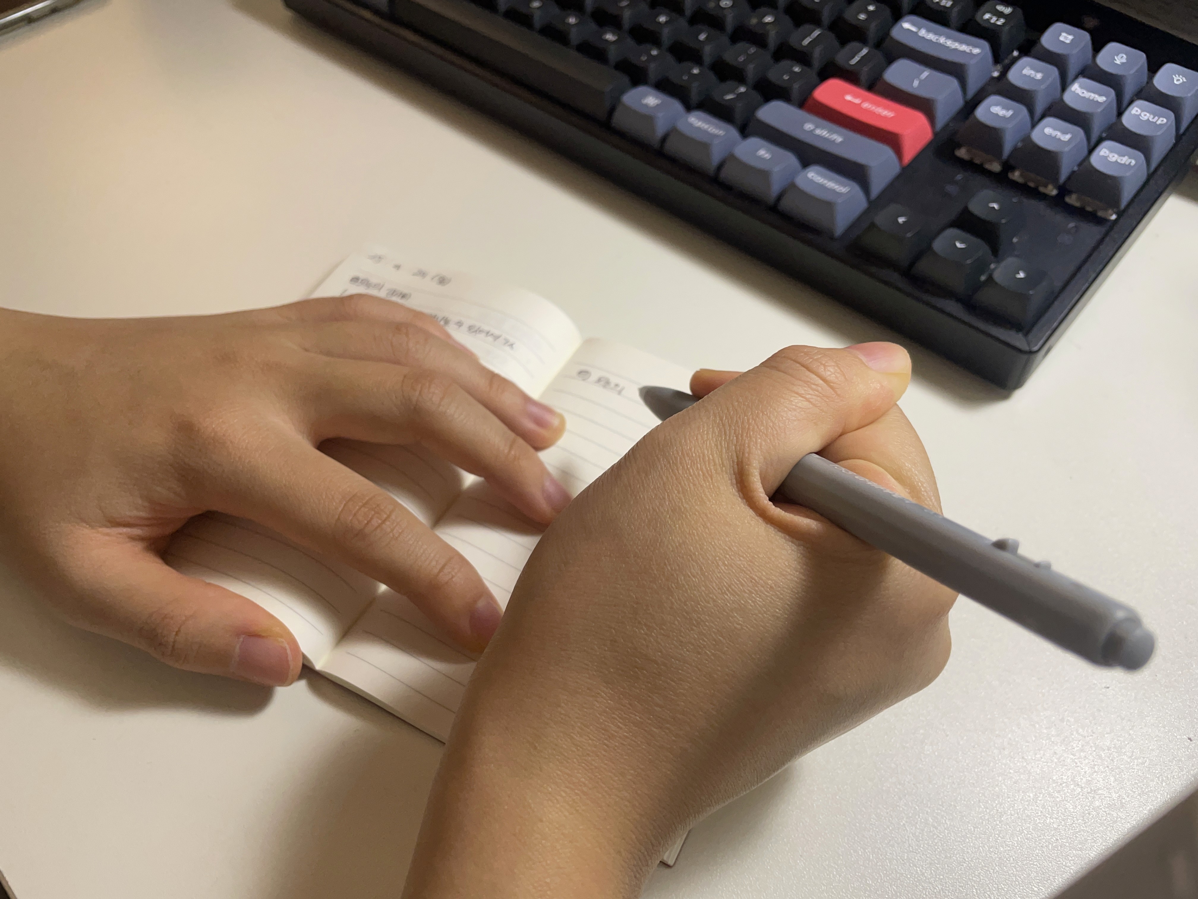
To enhance positivity, I began sharing a gratitude journal with six friends. For the first month, everyone participated regularly. However, as time passed, engagement steadily decreased.
I became curious about why people gradually stopped writing and sought to understand the factors influencing this drop in participation.
Hypothesis
The issue is not simply a failure to form a habit, but rather a lack of emotional connection to the journaling process, which leads to diminished motivation.
Research
Desk Research
Most journal apps focus solely on writing.

They emphasize the act of inputting text, but lack features that provide emotional feedback or sustained motivation. As a result, users often lose interest over time due to a lack of perceived meaning or value.
Analog journaling offers emotional depth but lacks continuity.
Writing by hand feels more immersive and personal, but it doesn't offer digital features like data tracking or motivational prompts to sustain the habit.
Target Users
Sporadic Users: Who write sporadically and eventually stop
These users write occasionally but gradually stop over time.Lapsed Users: Who kept a journal for over a year but eventually quit
These users consistently kept a reflection or gratitude journal for a long period but ultimately stopped.
User Journey Map
Identified the pain points and gain points journal users experience throughout their journey

❶ Burden of Perfection
Users feel pressure to write “properly” or “a lot,” which makes the habit hard to maintain.
❷ No Sense of Progress or Feedback
Without visible growth, rewards, or encouragement, users feel disconnected from their own writing journey.
❸ Lack of Motivation
Users start with good intentions but lose interest due to repetitive and unengaging journaling experience.
Problem Statement
Users initially write journals voluntarily, but over time, their motivation fades and they gradually stop recording.
► This happens because they start without clear goals and find it hard to perceive their own progress through journaling.
Insights
❶ Make journaling simple and intuitive.
When users feel they need to think too deeply or structure their writing perfectly, journaling becomes burdensome. A lightweight and intuitive entry method encourages users to write more naturally and consistently.
❷ Provide meaning through data accumulation.
Journaling may feel pointless in the short term, but visualizing long-term trends or reflecting on past entries helps users rediscover its value and motivates them to continue.
❸ Support long-term motivation.
Beyond intrinsic goals, users stay motivated when journaling becomes part of a personal or social ritual. Setting routine based goals, earning light rewards, or sharing moments with friends can help turn journaling into a habit worth keeping.
Goal
Help users consistently journal by setting clear goals and visually tracking their progress.
As records accumulate visually, users can intuitively recognize that they are consistent and see how their emotions have changed.
Design
Design Thinking
Thinking 1 - Add Journal
Keep journaling quick and effortless

A multi-step user flow didn’t suit small, quick journal entries. So I redesigned it using dropdown menus, allowing users to write everything on a single page.
A gentle space for daily positivity

To encourage short and consistent daily writing, the input field is kept small and lightweight.
Long fields can feel burdensome, especially when the goal is habit-building, not lengthy reflection.
The field expands vertically as needed with no character limit, allowing freedom without pressure.
Thinking 2 - Analyze Writing Type
Analyze and reflect user journaling patterns

Understanding users’ preferred journaling styles such as gratitude-focused or reflective entries enables personalized feedback. Recognizing patterns gives users meaningful insights and keeps them engaged.
I made sure to name the writing types in a neutral and positive tone, so that no user feels negative.
First Iteration
Initial Wireframe


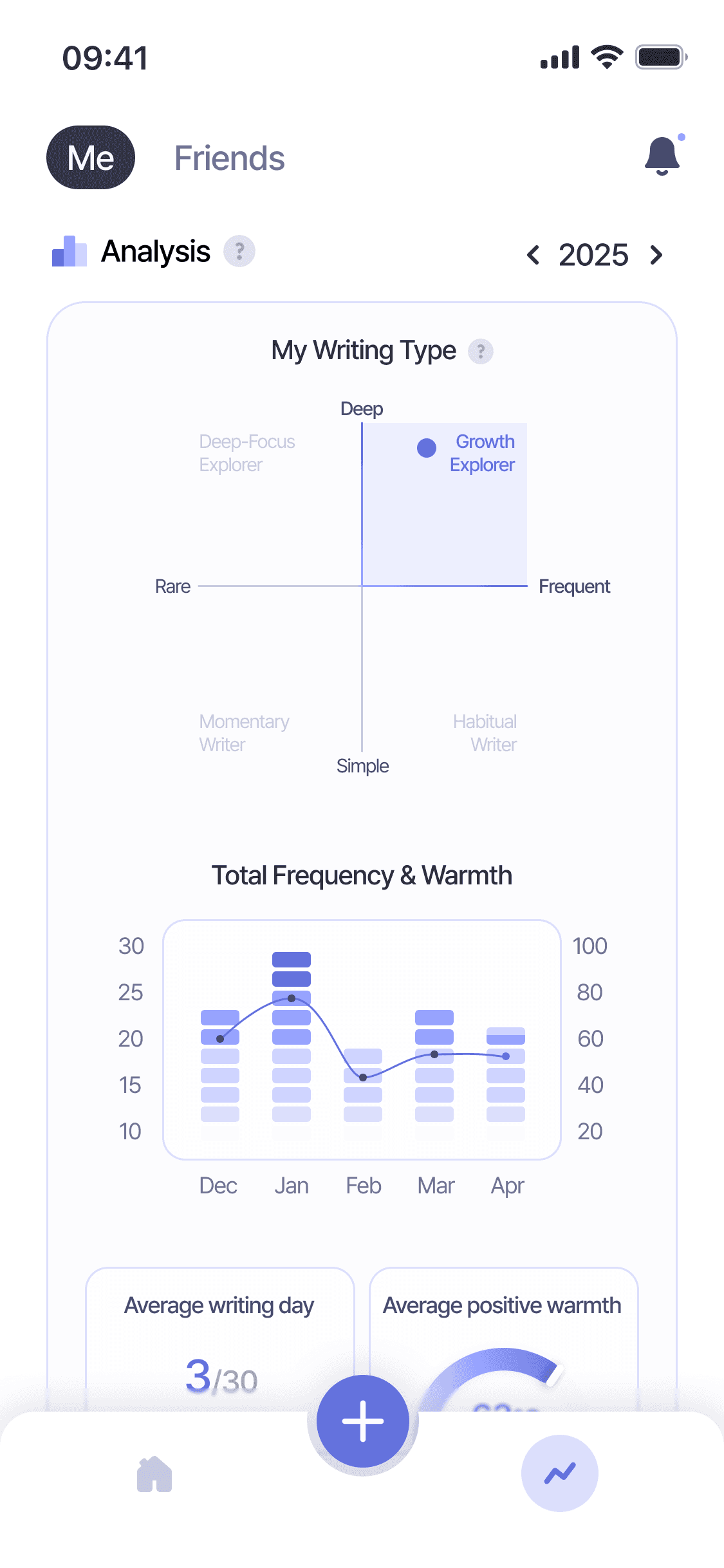
The previous design aimed to offer a wide range of features, including calendar tracking, routine progress, and journaling insights all within the home screen. The intention was to provide users with a holistic view of their activities and achievements at a glance.
User Interview

USER A
"I’m not really sure what I’m supposed to do on the main screen.
All I want is to record my day right away and just see everything I’ve written at a glance."

USER B
"I usually write in my journal at night because I see it as a way to wrap up the day. Since I write at night, I don’t really like bright screens."

USER C
"The graphs aren’t that meaningful to me. The writing type analysis is interesting, but I don’t know how it’s determined. There’s just too much information, so it’s hard to take it all in at once."
As more features were added, the interface became visually cluttered and harder to navigate.
Users found it difficult to focus on the core action: Journaling.
Problem Statement
1
Core actions are not prominent
Quick entry writing and past reflection viewing are not easily accessible.
2
Bright UI doesn't support nighttime use
Most users journal at night but find the screen too bright.
3
Simply listing statistics does not evoke a sense of accomplishment
As simple statistics pile up, user fatigue increases, so only key insights are provided.
Final Design
Solutions
Solution 1
Focus on View and Write on the Home Screen

Instead of overwhelming users with multiple features, we focused on the core theme, journaling. Users can now view their entries at a glance, grouped by date and routine, allowing for a more natural reflection and sense of continuity in their writing journey.
Solution 2
Quick writing with a Floating Action Button
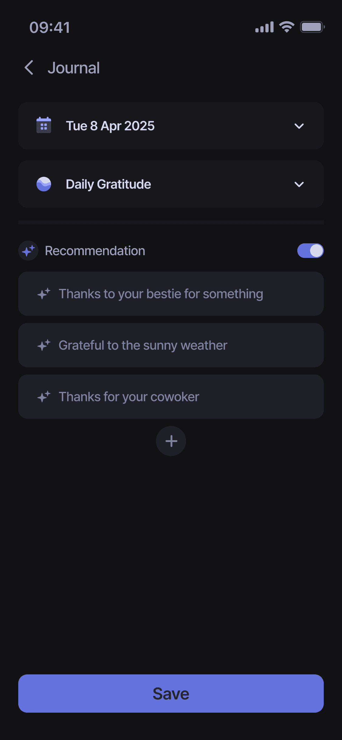
To reduce visual noise, I removed the bottom navigation bar and introduced a single floating action button.
Tapping the "+" opens a quick sheet where users can either start journaling or set up a writing routine. All actions from selecting the date to choosing a routine and writing happen on a single page for a smooth, uninterrupted flow. And when users don’t know where to begin, our AI recommendation gently guide them with thoughtful prompts.
Solution 3
Include cumulative insights or visual elements that stimulate accomplishment
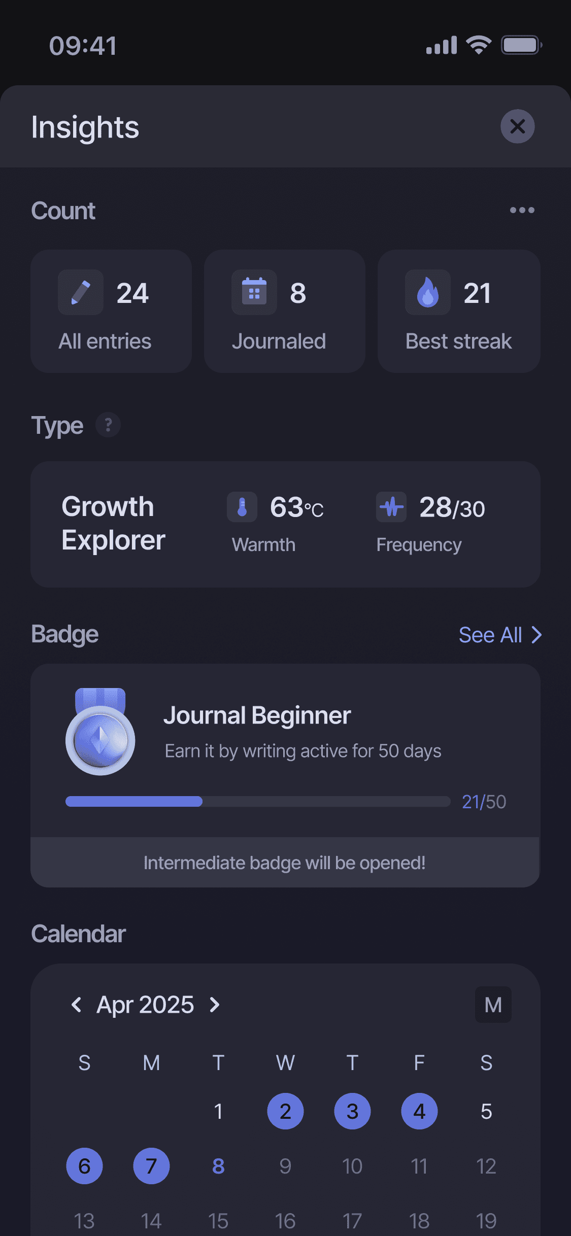
To reduce visual clutter and help users focus on journaling, previous elements like calendar, routine status, and goal progress were moved to the new ‘Insights’ section. There, users can track their writing patterns and progress more clearly. Also, to boost motivation and provide a sense of achievement, I also added a ‘Badge’ feature within this space.
Branding
Branding Story
Service Name
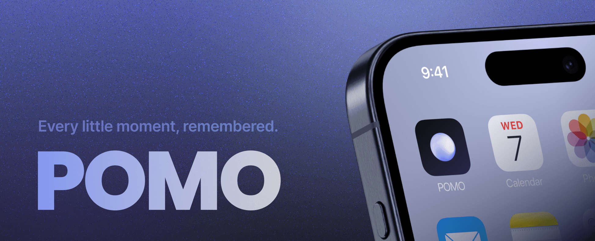
“POMO” stands for “Pieces of Moments.”
It reflects the app’s purpose: helping users capture and appreciate small, meaningful fragments of everyday life, whether it’s a note of gratitude, a reflection, or a goal achieved.
A Play on "FOMO"
The name also playfully contrasts with FOMO (Fear of Missing Out).
While FOMO pushes people to chase what they don’t have, POMO encourages users to cherish what they already have, their own moments, feelings, and progress.
It’s a mindset shift from scarcity to gratitude.
From fear to presence. From missing out to appreciating now.
Logo
Small moments create big changes.

Just like the logo that starts as a hollow shape and slowly fills up, users build a meaningful day by recording small moments of thankfulness. It visually reflects the app’s philosophy, cherishing even the smallest moments and emotions.
Next Step
What's Next?
To validate the second iteration of the design, I plan to conduct a usability test targeting users who match our primary persona. The goal is to identify any remaining usability issues, especially regarding task flow and content clarity.
Based on the findings, I’ll prioritize improvements for the final iteration and document insights that could inform future feature development.