
Over 50% Task Time Reduction Through Data-Driven UI Redesign
ROLE
UX/UI Design
TEAM
1 PM
4 UXUI Designer
CONTRIBUTION
UX/UI Design 60%
Usability Testing 80%
DURATION
Sep 2022- Dec 2022
Overview
Slack is used as a communication tool in various spaces such as companies, clubs, and schools.
Since it is widely used across different groups, I was curious about how users from each group use Slack. To evaluate its usability more specifically, I conducted an assessment using an eye tracker to follow the users' gaze.
Process
Conducted two rounds of usability testing: the first using an eye tracker, and the second using Maze to validate the design.

UT Planning
Usability Test Process
Selected participants

Participants were recruited for each role based on their Slack proficiency and the size of their organization.
Structured a task hierarchy

Tasks were categorized into primary, secondary, and additional levels, with difficulty evenly distributed.
Conducted user testing
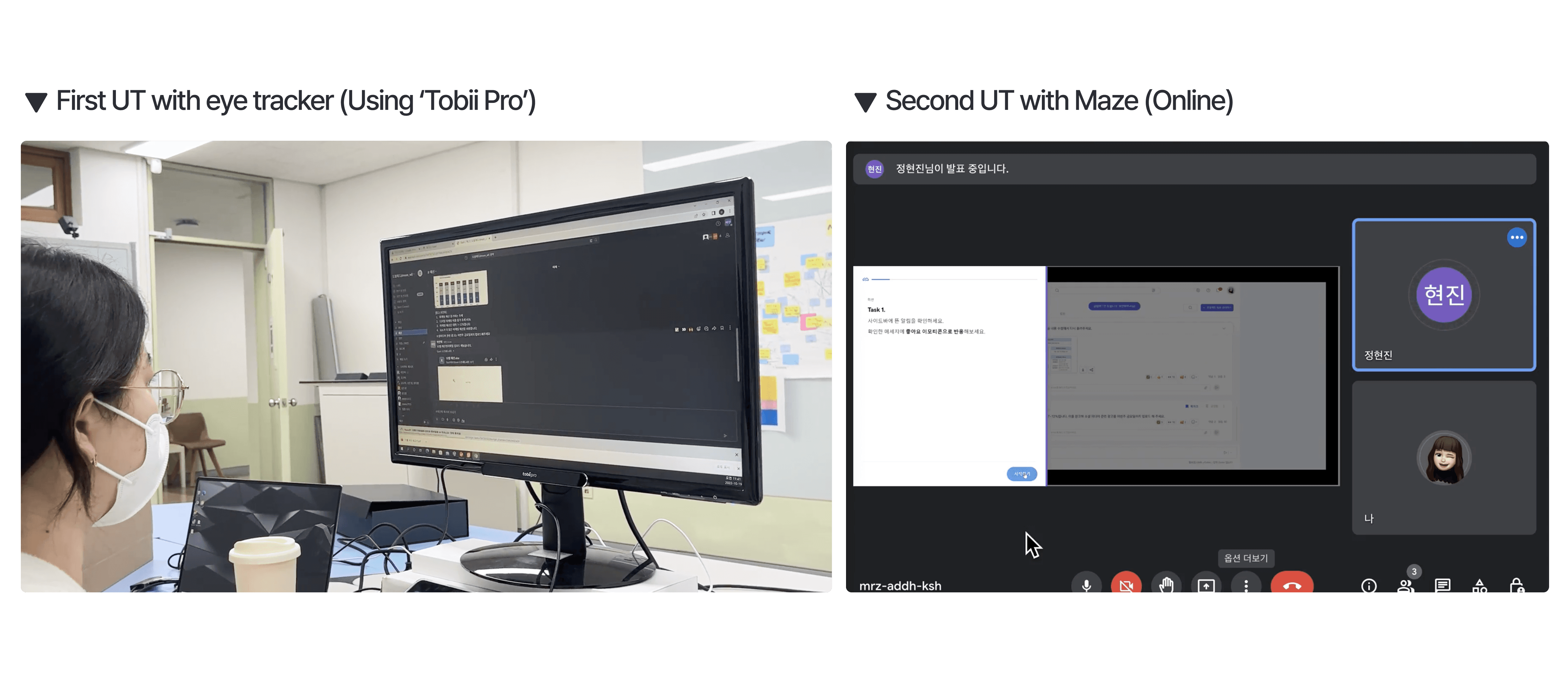
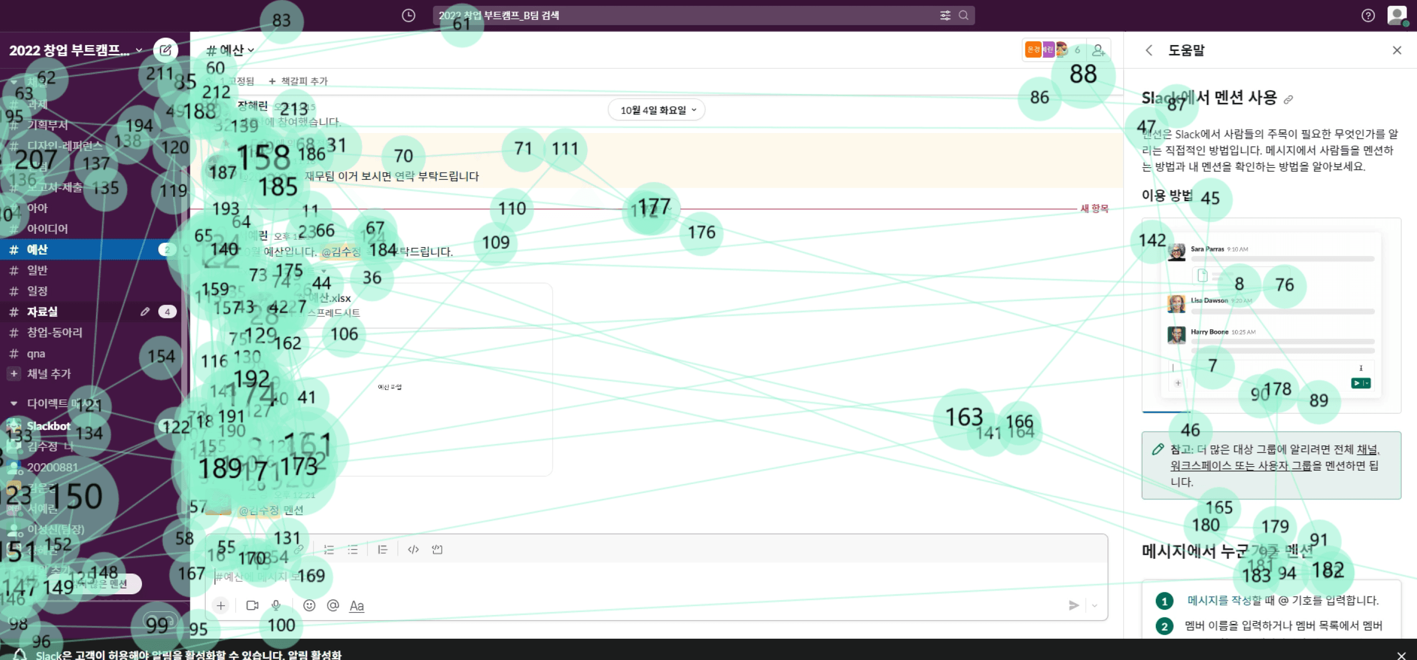
The first used eye-tracking to identify specific pain points in the current Slack interface.
The second, after redesigning, used the online tool Maze to quickly validate usability improvements.
First Usability Testing
Analyzing Data
Beginners cannot find the save icon and repeatedly right-clicks the message
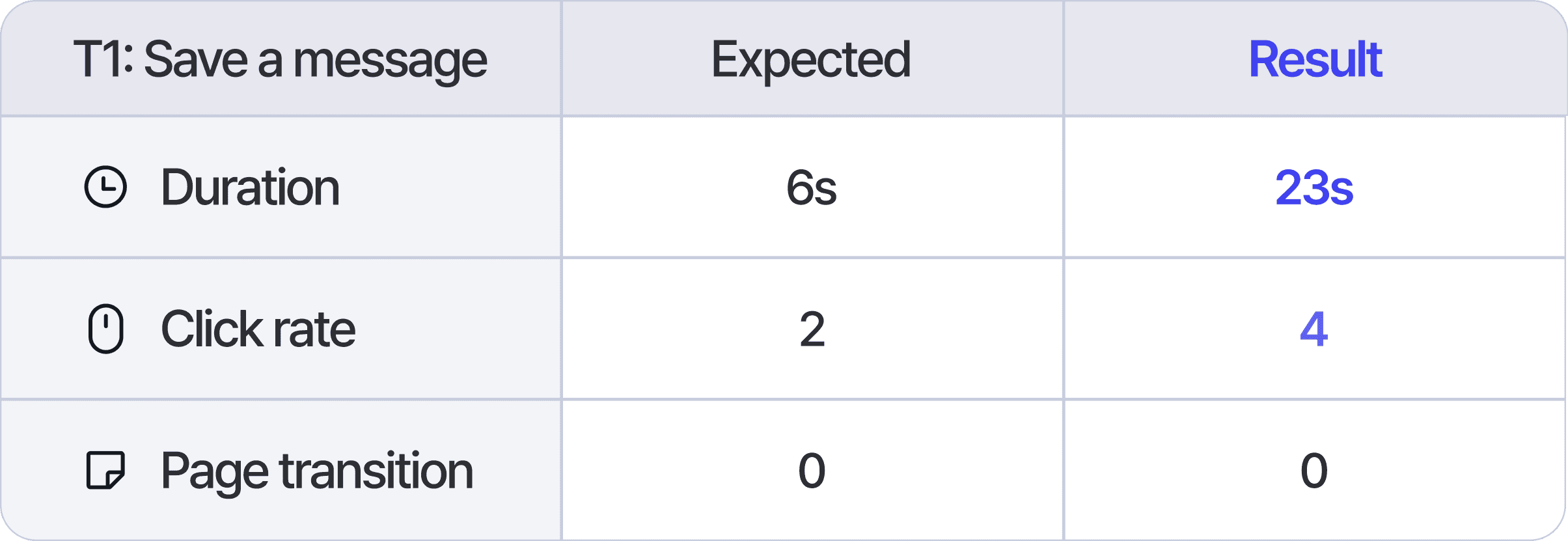

The “Save a Message” task posed the greatest difficulty for beginner users, as they struggled to identify the supplementary function icons within the message interface.
Masters cannot recognize how to add and use apps in Slack


Even master users commonly faced difficulties when interacting with external apps. The absence of a clear CTA button and the complex usage flow caused confusion.
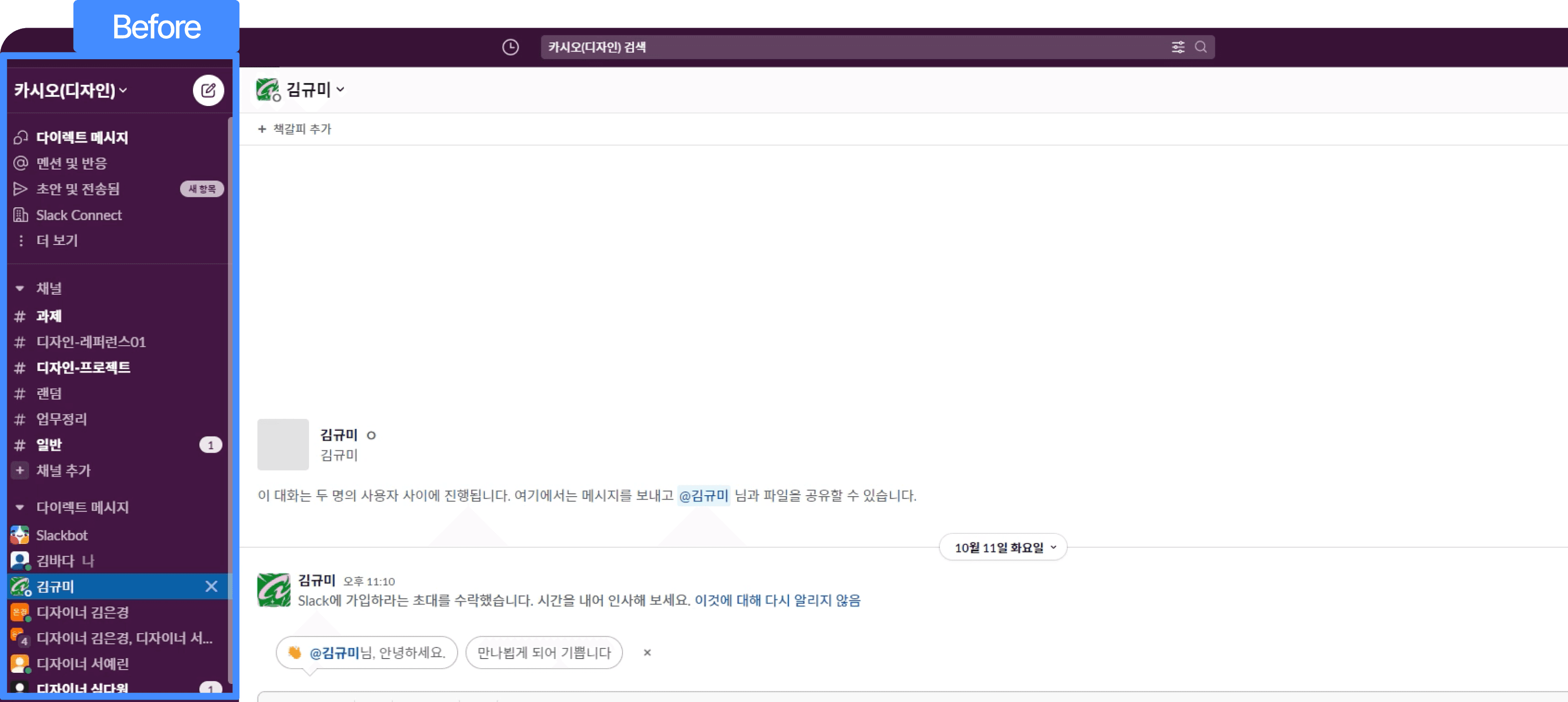
All participants found it difficult to locate channels quickly, as Channels and DMs were placed together.
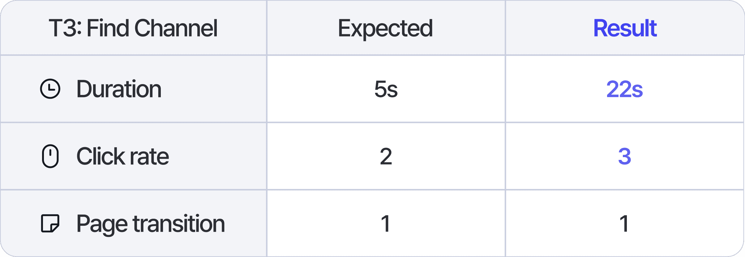
All participants experienced similar confusion during the “Find Channel” task. They had difficulty distinguishing between channels and DMs at a glance, often clicking the wrong item.
All participants experienced difficulty when attempting to check mentions and reactions.

It took users a long time to check mentions or emoji reactions directed only to them. They struggled to locate the correct notifications or confused them with other alerts.
Problem Statement
Across all user types from beginners to experienced users participants struggled to identify or access key functions. These issues were caused by a lack of visual clarity, unclear information hierarchy, and overly complex interaction flows.
Goal
Improve visual hierarchy and interaction flows so that users can quickly recognize features and complete key tasks with ease. Focus on reducing cognitive overload by minimizing unnecessary information and highlighting essential elements to enhance clarity and streamline the overall experience.
Key usability attributes
Analyzed the first UT results to identify the attributes causing issues
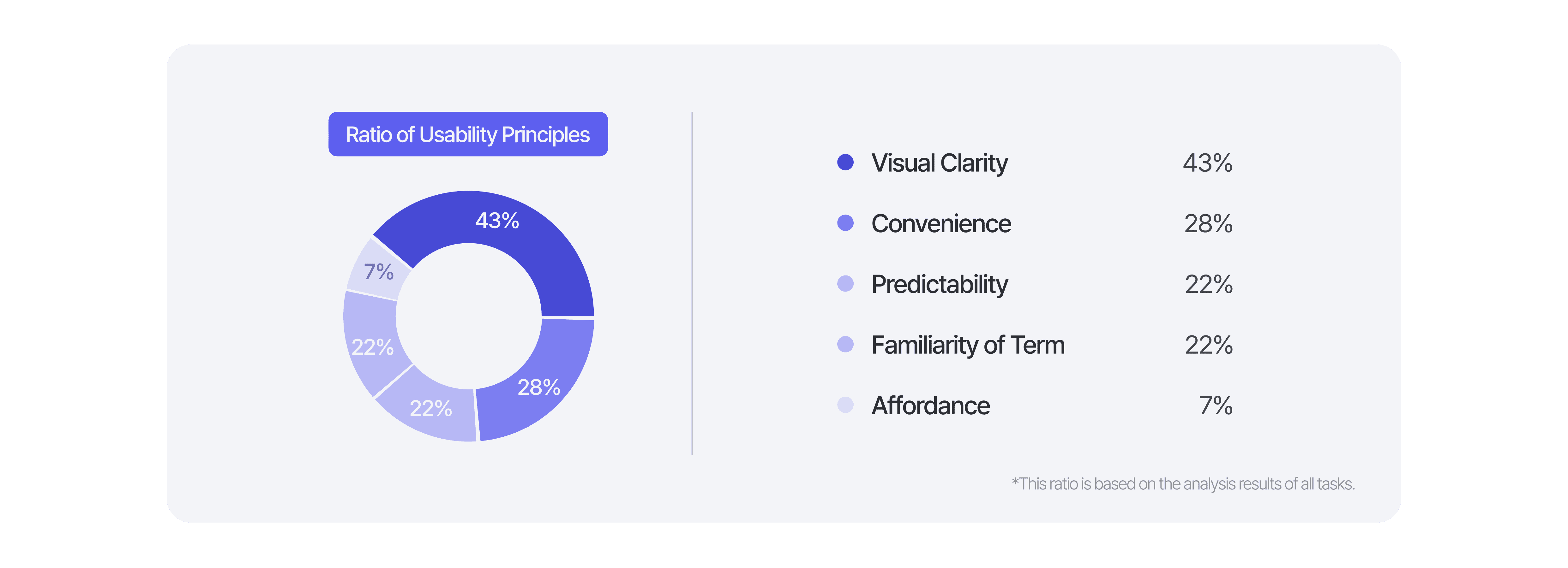
Among the five evaluation criteria, Visual Clarity accounted for the highest portion of usability issues. This indicated that users struggled with understanding the interface visually when trying to complete tasks.
Instead of making minor fixes, Our team decided to take on a more ambitious challenge, a full-scale redesign of the UI structure to address this core issue.
Redesign
ASIS-TOBE
Improving Visual Clarity
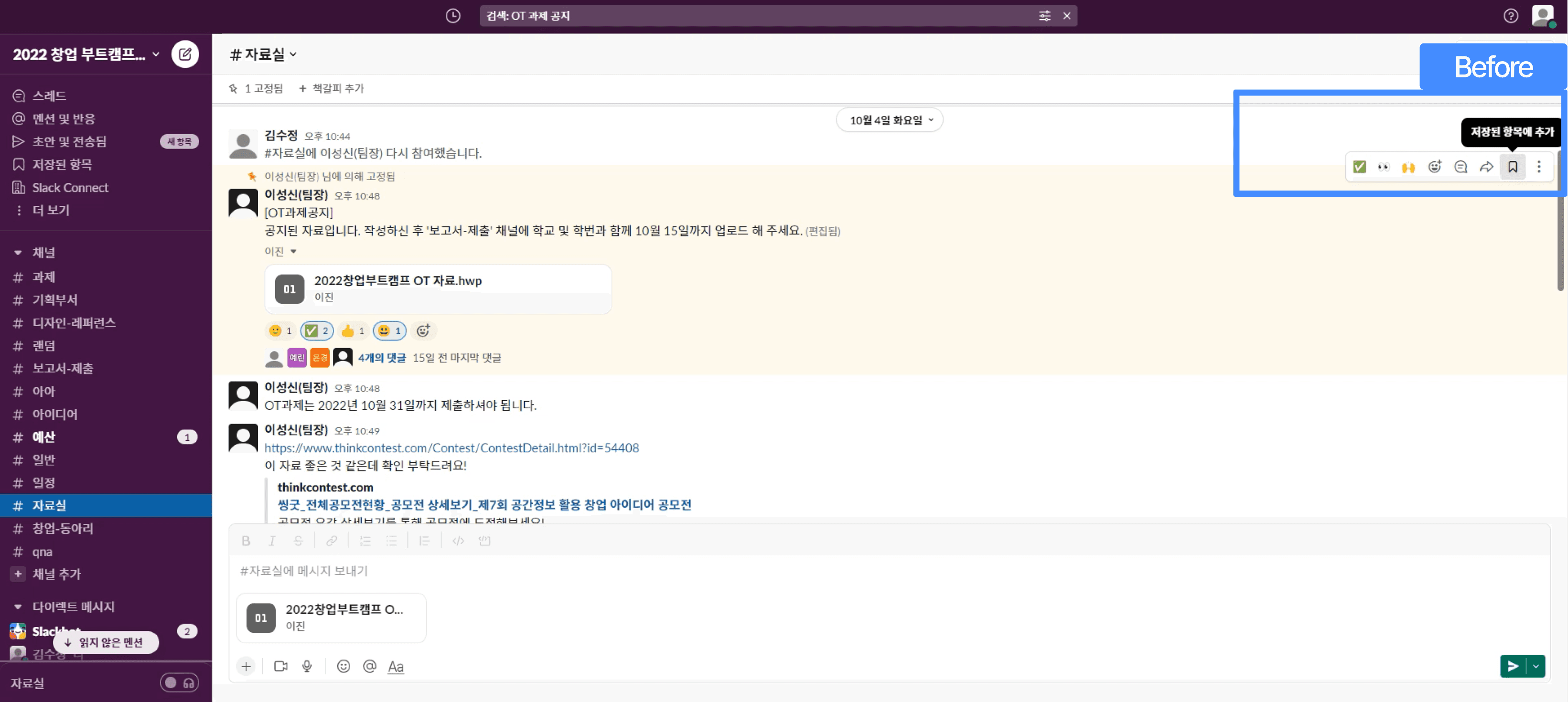
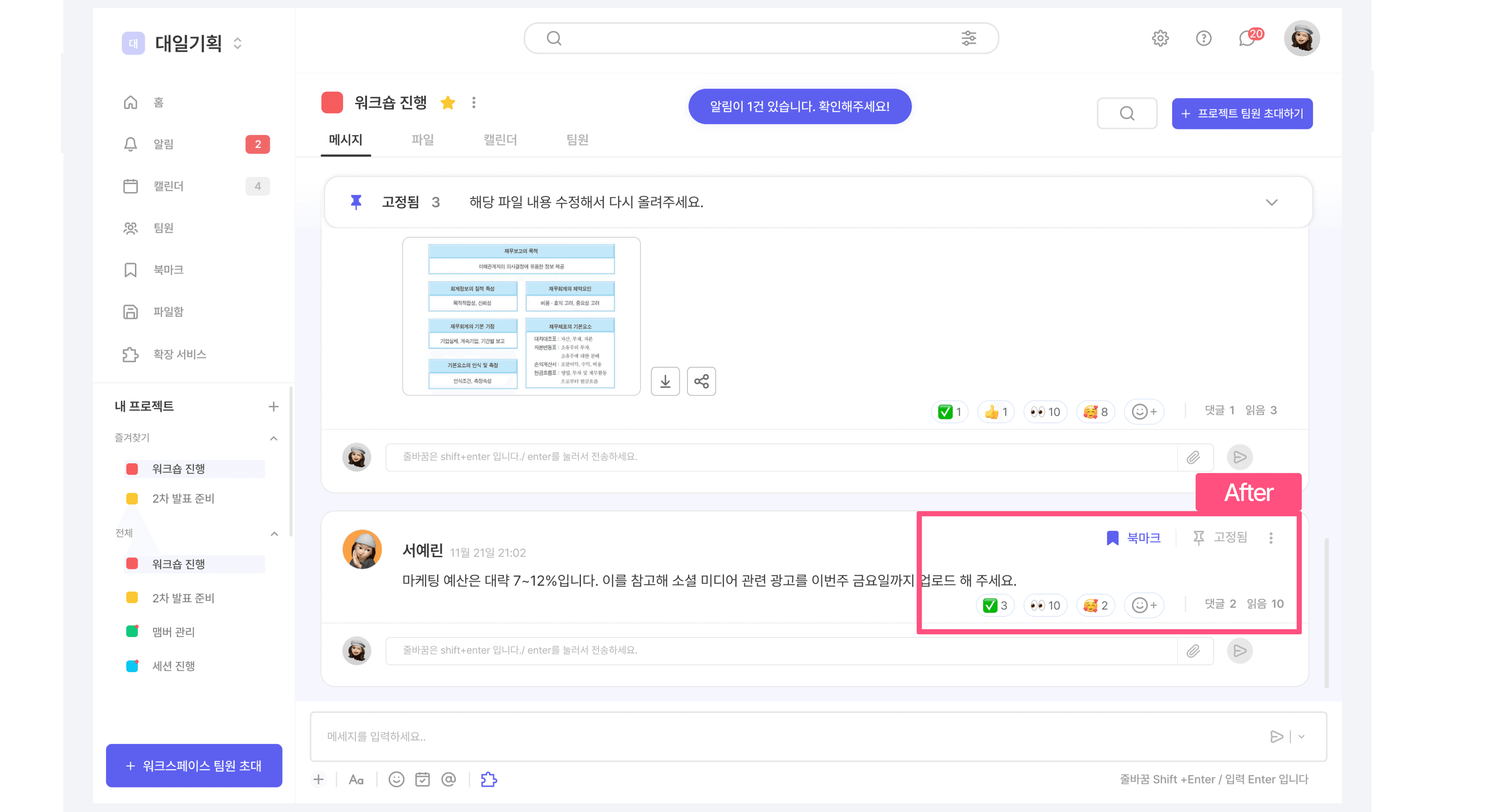
Save a message
Task completion time was reduced from 23 seconds to just 10 seconds.
How to resolve it?
Separate the emoji reactions at the bottom and main functions like bookmarks and pinning at the top to enhance visual clarity.
Simplify the terminology for easier understanding.
Improving Predictability
Use apps
Task completion time was reduced from 80 seconds to just 32 seconds.
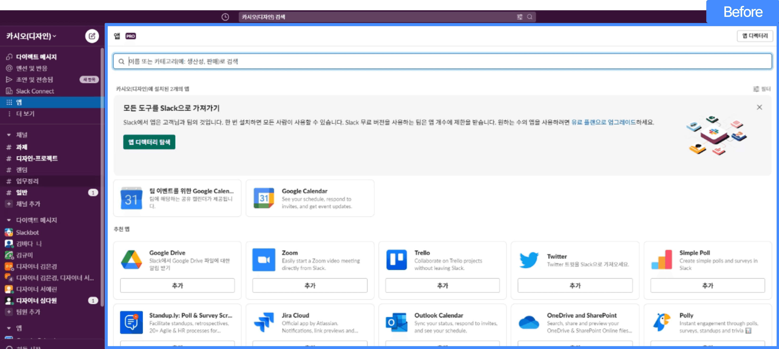

How to resolve it?
Explore apps and enable integration with an ON/OFF toggle.
Group all connected services in one place to make app integration management easier.
Improving Convenience
Find channel
Task completion time was reduced from 22 seconds to just 6 seconds.

How to resolve it?
Assign color labels to each channel for quick identification.
Improving Affordance
Check mention and reaction
Task completion time was reduced from 62 seconds to just 11 seconds.


How to resolve it?
Separate notifications related to the user
Distinguish between read and unread things and encourage checks through toast messages.
Reflection
Reflection
One limitation was the over-reliance on quantitative data, which made it difficult to capture deeper qualitative insights. Additionally, the number of participants was too small to confidently support broader design decisions. If I were to conduct this project again, I would increase the number of participants and aim to derive more logical and persuasive design directions through richer user data.