Homate: An app for managing chores with roommates
Homate: An app for managing chores with roommates
UX/UI Design
UX/UI Design
Jan 2025 - Mar 2025
Jan 2025 - Mar 2025
Team
Team
1 Product Manager, 1 Backend Engineer, 1 Frontend Engineer, 1 Designer
1 Product Manager, 1 Backend Engineer, 1 Frontend Engineer, 1 Designer
Role: UXUI Design 100%, UX Research 100%, Service Strategy 40%
Role: UXUI Design 100%, UX Research 100%, Service Strategy 40%
*I participated as a designer in the app development project.

Helping roommates share responsibilities and keep their living space organized with ease.
How nice would it be if my roommate had the same habits as me?
But in reality, clear differences always exist.
Especially when living together, those differences become even more noticeable.
How nice would it be if my roommate had the same habits as me?
But in reality, clear differences always exist.
Especially when living together, those differences become even more noticeable.

I identified the following pain points and designed a task management service
to help roommates manage and share chores efficiently
I identified the following pain points and designed a task management service
to help roommates manage and share chores efficiently
Service goal is to Improve communication by sharing things that need to be managed together
Service goal is to Improve communication by sharing things that need to be managed together

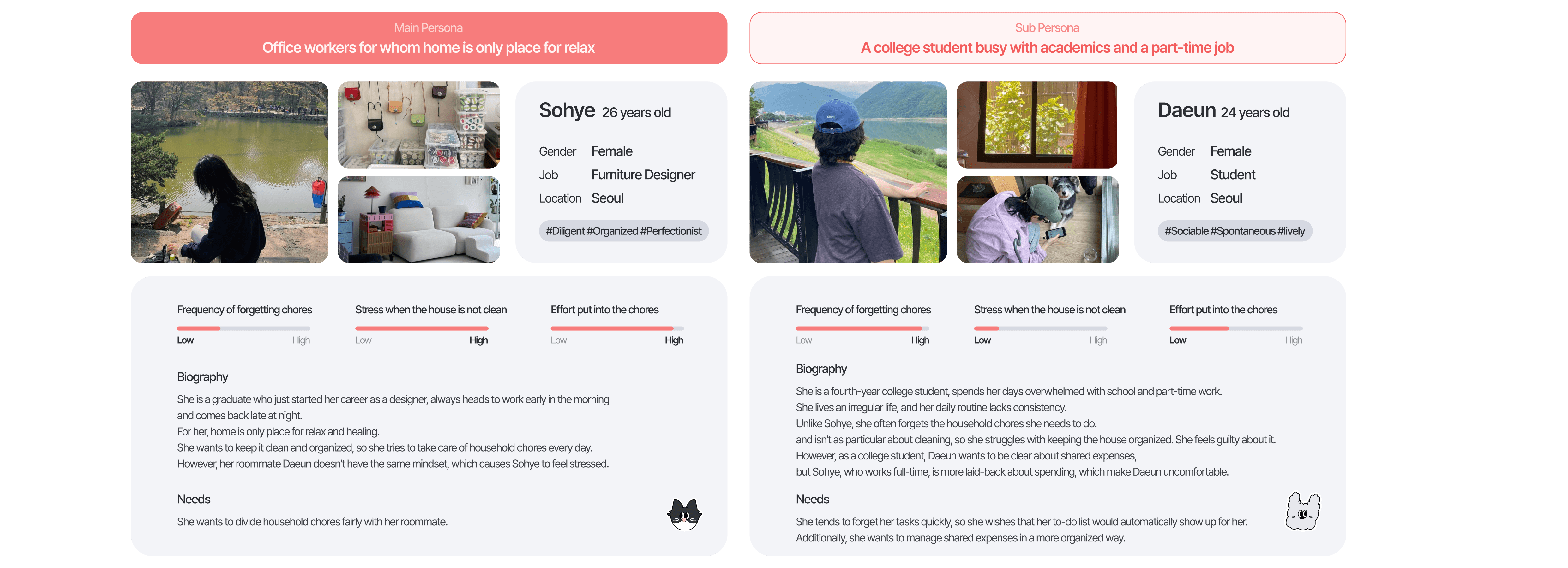
We targeted women in their 20s and 30s
and analyzed their needs by categorizing them into two types
We targeted women in their 20s and 30s
and analyzed their needs by categorizing them into two types
I felt the differences were as distinct as those between a dog and a cat, and used this insight to create personas.
I felt the differences were as distinct as those between a dog and a cat, and used this insight to create personas.
House chores are like "dust"
House chores are like "dust"
They quietly accumulate, often overlooked until they become overwhelming. I wanted to visualize this invisible weight we carry daily. That’s why I used the metaphor of dust to shape both the concept and the logo of the service.
To balance the heavy, burdensome nature of chores, I chose coral pink - a soft, friendly, and warm tone. Coral pink evokes comfort and approachability, making the service feel more like a helpful friend than a rigid taskmaster.
IA Design for Intuitive User Flow
IA Design for Intuitive User Flow
The app is organized into four key sections: Home, Home Settings, Roommates, and Statistics, ensuring a simple and efficient approach to managing tasks and responsibilities in shared living spaces.
The app is organized into four key sections: Home, Home Settings, Roommates, and Statistics, ensuring a simple and efficient approach to managing tasks and responsibilities in shared living spaces.

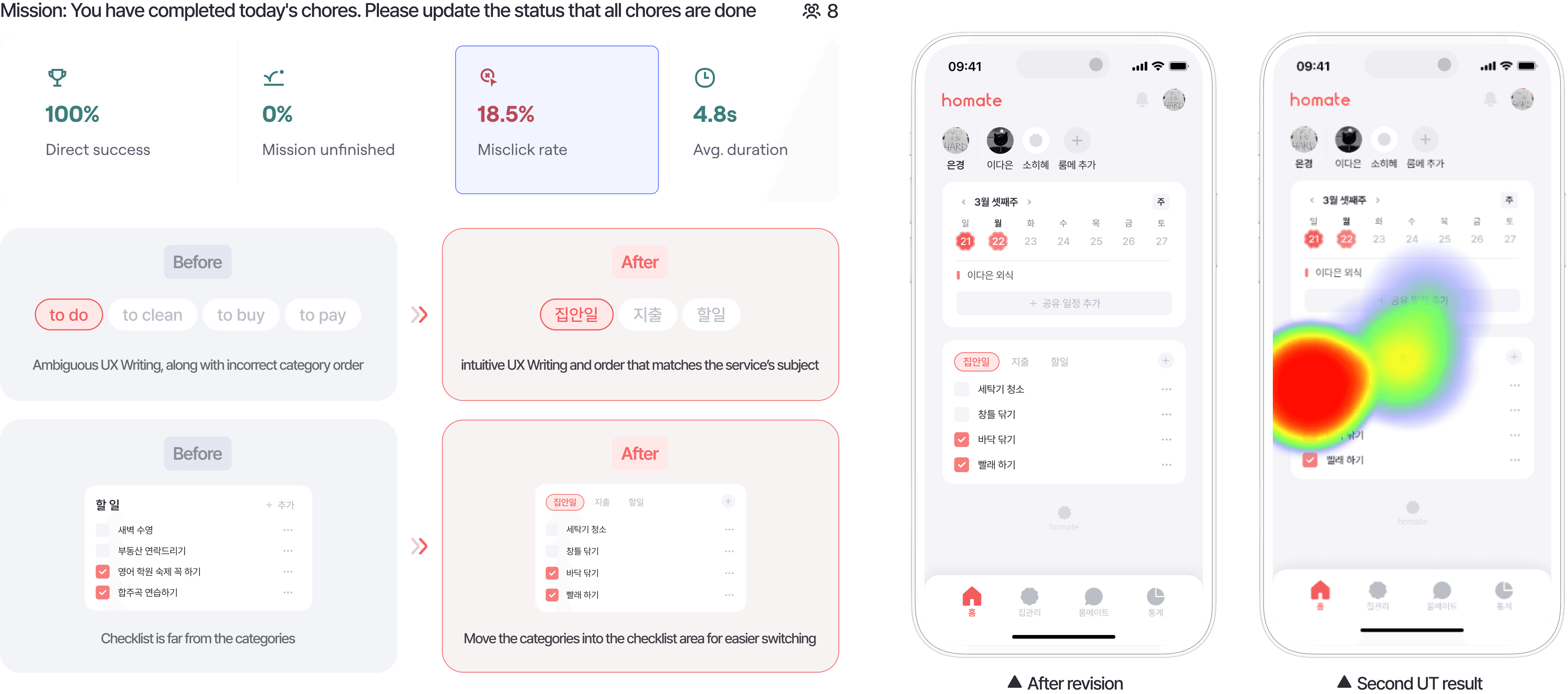
I conducted a Usability Test for validation
and discovered an issue on the main screen
I conducted a Usability Test for validation
and discovered an issue on the main screen
Users unable to recognize categories and performed it on the To-Do area
Reason 1: The user didn’t expect the [To Clean] category to be the household chores page.
Reason 2: The long click distance between the top category and the checklist.
Reason 3: Despite of household chores management service, the [To-Do] list is set as the first screen.

After the redesign,
a second UT was performed, resulting in a 62.9% decrease in click errors
After the redesign,
a second UT was performed, resulting in a 62.9% decrease in click errors
Ambiguous UX Writing, along with incorrect category order -> intuitive UX Writing and order that matches the service’s subject
Checklist is far from the categories -> Move the categories into the checklist area for easier switching
Ambiguous UX Writing, along with incorrect category order -> intuitive UX Writing and order that matches the service’s subject
Checklist is far from the categories -> Move the categories into the checklist area for easier switching
HoMate is currently in development for an upcoming app release. Stay tuned for the future evolution of HoMate!
HoMate is currently in development for an upcoming app release. Stay tuned for the future evolution of HoMate!

Next Project